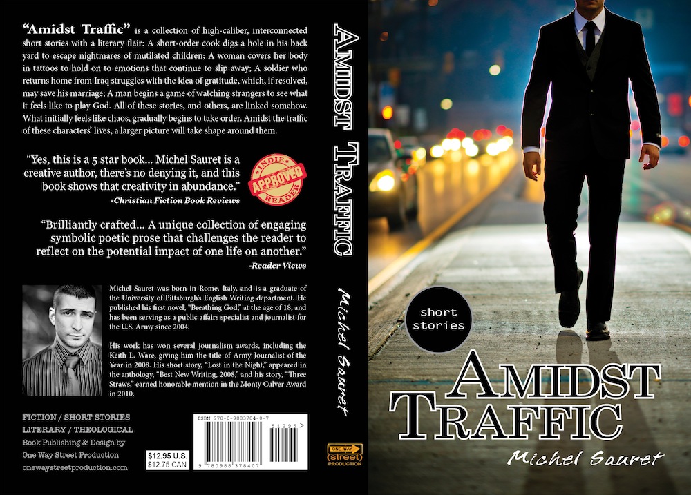
Designing the right book cover takes patience and effort. But the final product is completely worth it.
(This cover holds an updated back, which will be included with all Renewed Edition paperback copies of Amidst Traffic)
I don’t care what idioms say, people judge books by their cover.
We are attracted to what is visibly appealing and we gravitate toward colorful or bold designs. When I was getting ready to publish Amidst Traffic, I set out to design the best cover I could possibly execute on my own. I knew that unless the cover caught a person’s attention, there would be little chance that person would consider reading it.
Before designing my cover, I searched the web for ideas, but no blog discussed the thought process behind the cover design. Hopefully I can shed some light on that process based on my experience.
Designing a good cover requires Talent, Time & Tinkering
Start working on your cover early. Even once you’ve officially decided on the image you want to use, you’ll want to use professional editing software to layout your title and name on the front.
If you’re not that great at using Photoshop, get someone to help you. The font you use is JUST as important as the image you choose. If you look cheesy or childish font, your cover will SCREAM self-published. You want the final package to look professional and compete with industry-standard covers.
It helps to have other books in hand (or search online) that match your book’s genre and execute a cover that can compete with their quality. Take a careful look at not only the font used, but the size, spacing, layout and overall balance. You want your final cover to have a flow that allows the viewer’s eyes to take everything in without being overwhelmed.
Once you think you’re finished with the design, save it and let it be for a few days. Then when you return to it, look over it again with fresh eyes and make minor adjustments that will enhance the final design.
If you don’t have any photography talents you can buy a stock image (discussed later), and if you’re not any good with Photoshop or other design software, then I highly recommend that you pay for a cover design. For less than $400, CreateSpace can provide some really decent cover design services.
Don’t skimp out on the book cover. This is the most visible sales piece for your book.
Before you launch your cover officially, test it with your audience
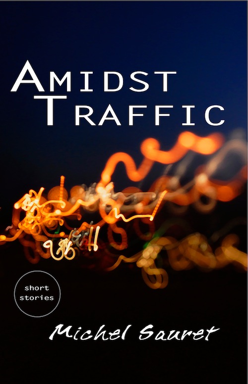
Originally, this was going to be the book cover for Amidst Traffic. I had a personal attachment to this design. I loved it especially because it was abstract and it conveyed a sense of chaos that represented the scattered lives in the book.
I liked the abstract cover because of the book’s genre of literary fiction, which is not commercial in style and it provokes the reader to think more.
But when I showed this cover around to friends, it was mostly met with looks of confusion.
“What is it?” people asked, or “I don’t get it.”
The cover was colorful and eye-catching, sure, but it also didn’t make sense. The title said Amidst Traffic, but the swirls of lights beneath were nothing like traffic lights.
(In fact, the swirling lights were captured by doing a slow-shutter shot of street lights and moving the camera in circling motions)
It doesn’t matter how much you, as the author, love a specific cover. If your audience is confused by it, you’re not going to get them to read the book. So it was back to the drawing board for me.
Setting the right mood and conveying the right idea with the cover
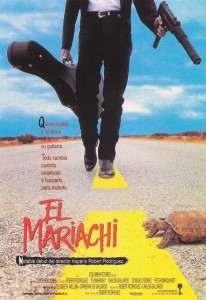
The movie poster to El Mariachi served as the inspirational framework for the cover shot of “Amidst Traffic.”
My concern with designing the book was this: Because the book is a collection of short stories, how could I possibly design a cover that represents all of the stories?
For several weeks I racked my brain to find the answer, and then it finally came: You can’t.
You simply can’t design a cover that does it all. Not unless you have a tremendous amount of time, budget and talent in execution, then maybe you can come up with a movie poster style cover that includes all of the characters. But simply wasn’t feasible. I had to pick one story and find a way of presenting it in the cover.
With Heather, we brain-stormed some ideas, and finally came up a scene from “Amidst Traffic” (the short story), where Lyonia sees a man in a business suit walking in the middle of traffic.
This was perfect. The image would encapsulate the title of the book, represent a scene from one of the stories, and convey the sense of mystery and discovery that the collection provokes.
My hope is that the reader might see the cover and wonder, “Who is this man? Why is he in the middle of traffic?”
Executing the cover shot
As some of you know already, in addition to being an author, I’m also a photographer. And in my humble opinion, I’m a darn good one.
Originally I wanted to hire a model to play the role of Adren Banner, who is the figure on the front cover. Adren is a member of the Duct Tape People, an underground organization that watches over visionaries who see disastrous visions of the future.
Unfortunately, after a few more weeks of searching, I never found a model who fit my original vision (I wanted a tall, lean man with black hair that fell down to his neck). So instead, I decided I would model the cover, and we would crop the frame at the chin. But the next question was, who would take the shot? And where are we going to do it?
I chose Banksville Road in the south hills and then Oakland (Pitt Campus) and downtown Pittsburgh.
I had my friend, Matthew Kovalcik take the shots with some direction using my Nikon D800. That was the perfect camera for this project because I wanted commercial-quality images that could be blown up huge later on if needed, or even cropped off without losing essential resolution that would make the image useless.
We went out on Banksville Road first before sunrise, and used a wirelessly-triggered flash to create the back-lit shot that we chose for the cover.
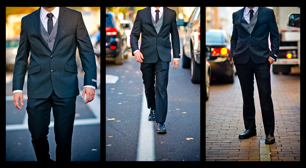
Here are some of the other images I considered for the cover:
These are all fine images by themselves, but because the sun had risen, we lost the dark and mysterious mood that I really wanted. The sense of being in the midst of traffic is evident in all of these shots, but the feel I wanted to convey was gone.
By the end of the shoot, we had taken more than 600 images together. It was hard directing someone else with the camera since I’m so used to being the one shooting and directing the model. The script was flipped and it was definitely a challenge.
But in the end, we came up on top with an image I thought was really killer and that could sell the book from a visual standpoint.
Copyrights and ownership
One thing that hasn’t been discussed already is that if you don’t have rights to an image, it doesn’t matter how freaking awesome it is, you can’t use it!
With Matt, we worked out a verbal agreement that even though he was the one taking the shots, I would retain rights to all of the images. This point may sound confusing to some of you, so I want to make something clear to you. It doesn’t matter who owns the camera equipment being used for the photos you take, the person who snaps the picture automatically becomes the owner of those shots. Matt and I both know that, so agreed that he would defer the rights back to One Way Street Production but I would give him credit as the photographer in the copyright page of the book.
So let me say it again…
If you don’t own the rights to an image, DON’T USE IT FOR YOUR BOOK COVER!
You will get into some legal hot water down the road, especially if your book does really well.
If you don’t have any photography talents or you don’t know any friends who are good with the camera, you can always look into stock photography websites. There’s dozens of sites out there that will allow individuals to buy photos and use them for specific commercial projects.
However, I will caution you that if you come across an image that you think will be awesome for a book cover, other people might have thought of it also…
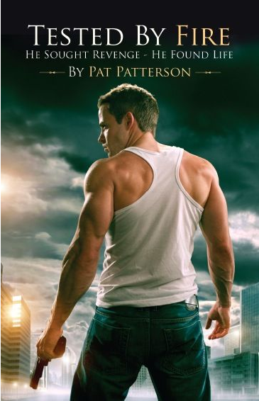
Take this book cover for example:
I swear I have seen this same cover shot for at least two other book titles. You can’t really blame the author for picking this image. After all, it conveys just the book’s genre: action adventure and a main character who is a buff badass about to crush villain skulls and break lady hearts.
I wasn’t able to find the other titles that use the same cover image, but once I do, I’ll update the post.
Having different books by different authors using the same cover shot can create market confusion. You want people who see this cover shot to think of YOUR book, not the other book that happens to have the same hero on the front.
I know that Amidst Traffic is the only book that will ever have this cover image because I personally executed it and designed it from start to finish. The only way someone else will have the same cover is if they steal that shot.
As mentioned above, my book cover was inspired by the movie poster of the movie El Mariachi (which is the low-budget prequel to Desperado & Once Upon a Time in Mexico).
What about you?
What was your process like in designing a book cover? Did you have any experience going into it? Do YOU judge books by their cover (initially)?
 Michel Sauret – Award-Winning Army Journalist | Independent Author Award-Winning Army Journalist, Independent Author


Great article! Thanks for going into so much detail about your design process. I went through a similar process designing my book cover, and it is nice to see I’m not the only one who took a while.
(Here’s a blog post I wrote about my process if you’re interested.) http://www.angelagmarshall.com/blog/designing-rook-and-shadows-cover
Thanks for the information on your book cover design process! I definitely judge a book by its cover. As you suggested, looking at other book covers in your book’s genre is important to get a feel for what other books in your field are like. It is also great for inspiration. I recently came across this article that has some good resources for finding a designer and hope other authors find it useful: https://scribewriting.com/book-cover-design/.